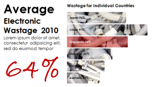
What if you could turn a drab Excel chart:
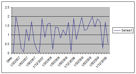
into something like these right in Microsoft Excel?
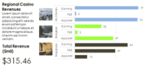


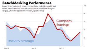
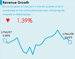


For many Excel users, there is a need to produce clear, concise and even attractive charts in Excel without using expensive software. What is lacking are the clear techniques to do so. Compelled by this need, Aeternus Consulting has designed a workshop to show participants how to achieve this objective.
The Workshop Outline:
- A collection of Formatting Chart Techniques.
- Demonstration of each technique to achieve beautiful results.
- How to replicate a Wall Street Journal chart.
- How to replicate a Economist Magazine chart.
- How to replicate a New York Times chart (read why this chart is beautiful?).
- Reverse-engineer other beautiful charts.
About Aeternus Consulting
Related Link: Aeternus Consulting Excel Training Courses Singapore
Aeternus Consulting offers an excellent workshop Storytelling with Data Visualization using Beautiful Excel Charts. This workshop is aimed at students visualizing thesis data, managers and analysts needing to communicate in a data-driven way and leaders informing their board to drive actions.
Related Link: Making Charts Beautiful with Microsoft Excel


One Response
finally, I could find your post again. You have few useful tips for my school project. Now, I won’t forget to bookmark it. 🙂