I will demonstrate the following chart formatting tips starting from Microsoft Excel 2003.

1. Remove plot area colours and borders.
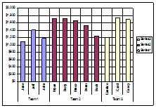
2. Remove any vertical grid-lines.

3. Change horizontal grid-line color from black to a very light shade of gray.

4. Adjust chart series colours to get better contrast, remove series borders.
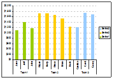
5. Increase data visibility by removing legends and setting axis to a light gray or remove axis lines if it is not needed.

6. Adjust font scaling if it too big and distracting. Choose a light gray font if the axis labels are too prominent.

7. Remove chart area background colours and borders.

8. Use cells around the chart to implement more flexible titles and comments colours. Cells can be coloured to add more flexible backgrounds.

These are simple things you can do to enhance your Excel charts. Turn Now turn these simple tips into powerful tools to communicate your data and business insights.
You can turn your Excel charts into full blown, beautifully designed diagrams in your annual reports, not with a publisher but with your very own staff.
Place it on a SharePoint site to communicate information to your colleagues worldwide; put in the web so that it can be seen on an iPhone. With a bit of imagination, the options are endless. You don’t have to be stuck doing the same things over and over again.
About Aeternus Consulting
Related Link: Aeternus Consulting Excel Training Courses Singapore
Aeternus Consulting offers an excellent workshop Storytelling with Data Visualization using Beautiful Excel Charts. This workshop is aimed at students visualizing thesis data, managers and analysts needing to communicate in a data-driven way and leaders informing their board to drive actions.
Related Link: Making Charts Beautiful with Microsoft Excel